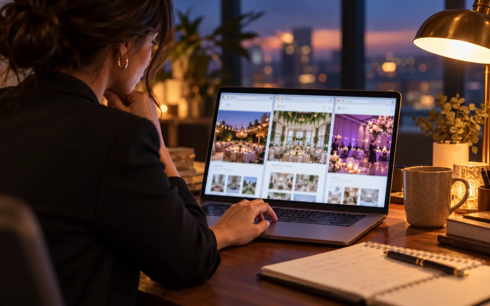
If your website gets visitors but not bookings, more traffic isn't necessarily the answer. Sending more people to a site that loses them only means losing more people. What you need is a website that helps the right people understand what you do, trust your work, take the next step, and hear back from you before they move on to the next tab.
Because that's what's really happening. Your visitor isn't reading your site alone. They have three or four event companies open at once, and they're quietly deciding which one feels safest to contact.
Get your free visibility audit →
Get your free visibility audit →
The Short Answer
An event company website gets visitors but not bookings when it loses people at a specific stage: they can't tell what you do in the first few seconds, they can't find proof you've done events like theirs, there's no obvious next step, the enquiry form feels like work, or the reply comes too late.
Find the stage where visitors leave, fix that stage first, then measure again.
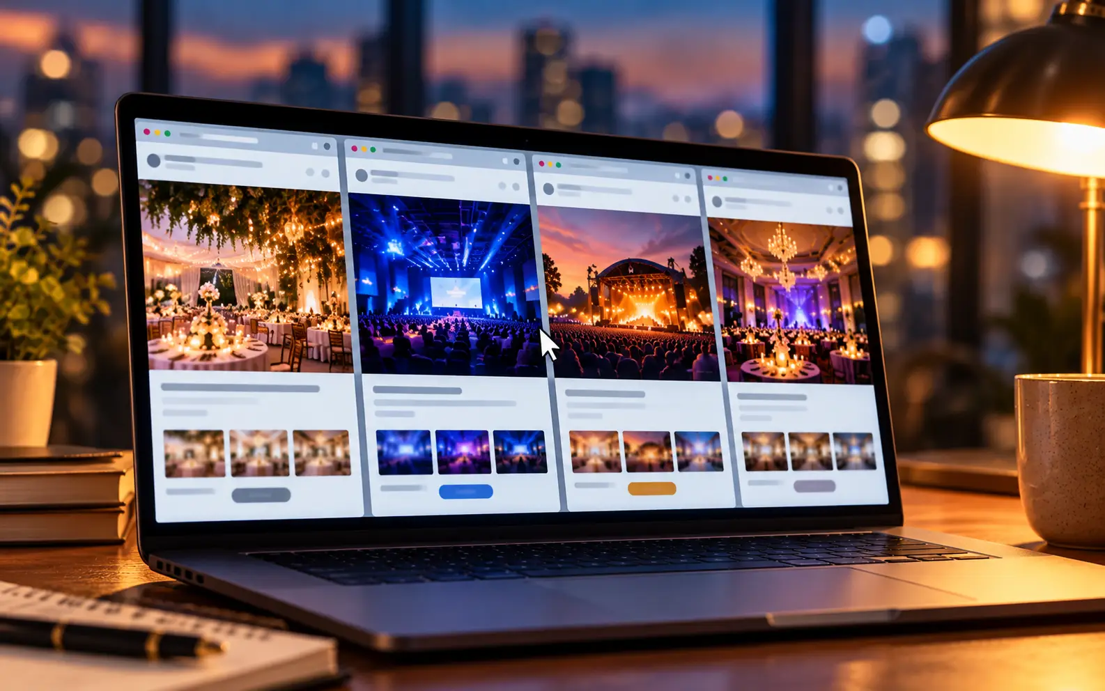
The LitBooked Booking Path
Every visitor who books you passes through the same six stages. Each one is a place where good opportunities quietly disappear.
First Glance → Fit → Proof → Next Step → Enquiry → Response → Booking
- First Glance: in a few seconds, do they know what you do and where?
- Fit: can they see you handle their kind of event?
- Proof: do real names, events and reviews back it up?
- Next Step: is there one obvious thing to do now?
- Enquiry: does contacting you feel quick and easy?
- Response: do they hear back while they're still deciding?
So the real question isn't "Is our website good?" It's:
"At which stage are your visitors leaving?"
Pass the 5 Second Test
Most event company homepages open with a logo, a menu and a beautiful stage photo. It looks impressive. But it doesn't say anything.
A planner landing on your site is asking three questions at once: What do you do? Do you work where my event is? Is this for events like mine? If the first screen doesn't answer them, many people never scroll.
What to do:
- Put a plain headline on the first screen: what you do, for whom, and where.
- Add one line of proof right under it: years in business, a review rating, or two recognizable event names.
- Place one clear button where it's visible without scrolling: "Check your date" or "Get a quote".
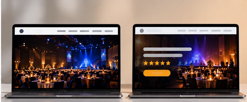
Before: Logo → menu → full width photo → scroll to find out what the company does.
After: "Sound, lighting and staging for festivals and corporate events in Atlanta" → ★ 4.9 from real clients → [Check your date].
The photo can stay. It just shouldn't have to do all the talking.
Show Proof Where Decisions Happen
Here's a pattern we see again and again in audits: an event business has worked major festivals, well known venues or big corporate brands, and that proof lives in one paragraph on the About page. Most visitors never open the About page.
Proof only works where people are deciding, and that's the homepage, the service pages and right next to the enquiry form.
What to do:
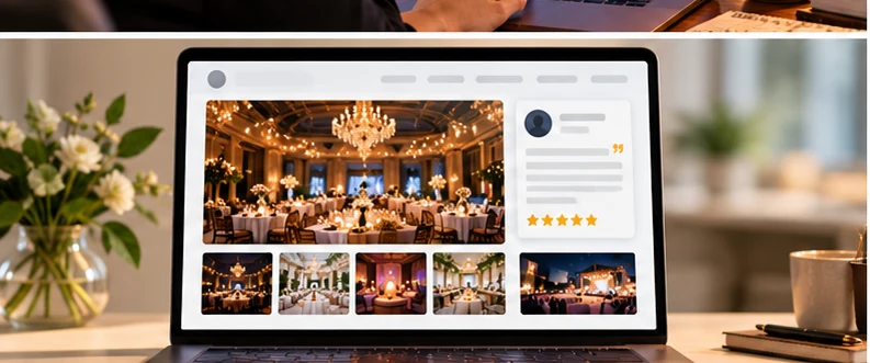
- Move your strongest names (events, venues, brands) onto the homepage, in the first two scrolls.
- Caption your photos. "Corporate gala, Hilton ballroom, 600 guests" sells; an unlabeled photo looks like it could come from anywhere.
- Put a real review, with a name, next to your quote button.
- Turn your biggest jobs into short case pages:
Event → Space → Challenge → What We Did → Result
Your Google reviews and Instagram may already contain your best proof. If it isn't on your website, the visitor deciding right now never sees it.
Give Every Buyer Their Own Door
A bride, a corporate event manager and a festival producer want completely different things. When one services page tries to speak to all of them, it speaks clearly to none.
What to do:
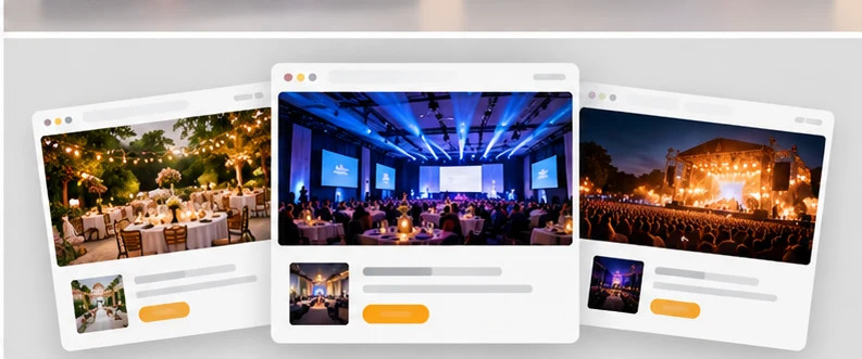
- Create separate pages for your main buyer types: weddings, corporate events, concerts and festivals, private parties.
- On each page, show work, reviews and packages for that buyer only.
- Link those pages directly from the homepage, so each visitor can pick their own path in one click.
Example: an AV company's corporate page talks about clean presentations, reliable streaming and on site technicians. Its wedding page talks about speeches people can actually hear and a dance floor that feels alive. Same equipment, two completely different reasons to book.
This is exactly what moved the needle for Northerncult, a designer lighting brand. Separating the paths for designers and contractors was part of the rebuild that led to $500,000 in sales in three months, as reported by the client. Different business, same principle: people book faster when the page feels made for them. See the Northerncult case study.
If you run an AV or production company, our pages on marketing for AV production companies and marketing for event production companies show how this looks for your business.
Make the Next Step Impossible to Miss
Many event websites end every page with "Give us a call" in small text, or a contact page that's three clicks away. Interested visitors hesitate, open a competitor's tab, and forget about you.
What to do:
- Use one main action across the whole site, with the same wording everywhere: "Check your date" or "Get a quote".
- Add it at the top, in the middle and at the end of every key page.
- On mobile, make the phone number tappable and keep a quote button visible as people scroll.
- Offer a second, softer path for people who aren't ready yet: text, WhatsApp, or "see packages".
The rule: a visitor should never have to look for how to book you.
Make Enquiring Feel Easy, Not Like Paperwork
There are two ways a form loses bookings. Too long, and people abandon it. Too short, and every enquiry needs a phone call just to find out whether it's worth quoting.
The fix is the right questions, not more questions:
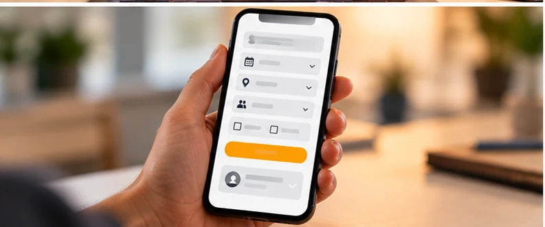
- Event date
- Event type (wedding, corporate, concert, private)
- Venue or city
- Guest count, roughly
- Budget range, as tick boxes, not a blank box
- Name, email and phone
Then add one reassuring line under the button: "We reply within X hours with availability and a starting price."
Before: Name → Email → Message → Submit → silence.
After: Date → Event type → Venue → Guests → Budget range → "Reply within 4 hours" → Submit.
You get better enquiries, and the visitor knows exactly what happens next.
Free calculator
Lead value calculator
See what your enquiries are worth today, and what a small lift in conversion adds over a year.
The last figure shows how much more you would book each year if your conversion rate rose by two percentage points.
Win the Minutes After the Enquiry
A visitor who submits a form has usually contacted two or three other companies at the same time. Often the first useful reply wins, not the best company.
What to do:
- Send an instant automatic reply: thank them, confirm what they asked for, and say when you'll respond.
- Reply properly within business hours, ideally with availability and a starting price, not just "Let's set up a call."
- Follow up if they go quiet, with something useful: a photo from a similar event or their venue.
This is where the website hands over to your lead generation and follow up system, and why a website alone never fixes bookings. The whole event marketing funnel has to connect.
What Most Event Businesses Get Wrong
They judge their website by how it looks, not by what it does. A site can be beautiful and still lose people at every stage. And a plain site with a clear headline, named proof, one obvious button and a fast reply will often out book a stunning one.
The second mistake is treating the website as finished. Your best work happens every month. If your site still shows the same gallery from years ago, your newest and most impressive events are only on Instagram, where the person comparing vendors right now won't see them.
What Probably Won't Work
"We just need more traffic." More visitors through the same leaks means more lost bookings.
"We need a redesign that looks more modern." A new look on the same structure gives you the same results, just prettier.
"We'll add more photos." Without captions, context and a next step, more photos are just more scrolling.
The better approach:
Find the stage where visitors leave → Fix that stage → Measure it → Move to the next stage.
Find Your Website Bottleneck
- Lots of visitors leave from the homepage quickly → The first screen doesn't say what you do, where, or for whom.
- People view the gallery but don't enquire → Photos have no context, and there's no next step beside them.
- Enquiries come from the "wrong" clients → There are no separate pages for each buyer, so everyone sees the same message.
- People start the form but don't send it → The form is too long, or asks for things they don't know yet.
- Enquiries come in but don't turn into bookings → Replies are slow, vague, or don't include availability and price.
- Good reviews on Google, few enquiries from the site → Your proof lives on Google and social, not on your website.
Your Google Analytics already shows most of this. Look at where people exit, which pages they view before enquiring, and how many reach your contact page but don't submit.
A Practical 30 Day Starting Plan
Week 1: Rewrite your homepage first screen: headline, one proof line, one button.
Week 2: Caption your 10 best photos and move your strongest names and one review onto the homepage.
Week 3: Fix the enquiry form (date, event type, venue, guests, budget range) and add an instant auto reply.
Week 4: Build one page for your most profitable buyer type, then compare enquiries against last month.
What Should You Work on First?
If people leave the homepage fast, start with the first screen. If they browse but don't enquire, start with proof and the next step. If enquiries come in but don't book, start with your response, not the website.
Not sure which one it is? That's what a short audit is for.
Looking for a full checklist of what to build? See our guide to what an event website should include <!-- LINK LATER: /resources/what-should-an-event-lighting-website-include/ after its rebuild -->, and when you're ready for the whole system, the Booked Website builds every stage of the path in one go.
Frequently Asked Questions
Why does my website get visitors but not bookings?
Usually because visitors drop off at one specific stage: an unclear first screen, missing proof, no obvious next step, a difficult form or a slow reply. Find the stage where most people leave and fix that first, rather than redesigning everything at once.
How many enquiries should an event company website get?
There's no universal number, because it depends on your traffic, prices and type of event. The useful measure is your own trend: compare enquiries per 100 visitors month to month, and check whether your changes move it up.
Should I show prices on my event company website?
You don't need a full price list, but some price signal helps. A starting from figure or package ranges filters out poor fit enquiries and makes serious buyers more comfortable contacting you.
What should an event booking form ask?
Keep it to what you need to reply with a useful answer: event date, event type, venue or city, rough guest count, budget range and contact details. Add a line saying how quickly you reply.
Do I need a new website to get more bookings?
Not always. Many sites improve a lot by fixing the first screen, moving proof onto key pages, adding a clear next step and tightening the form. A rebuild makes sense when the structure itself, like having one page for every service, is what's holding you back.
Does my website affect how Google and AI tools like ChatGPT describe my business?
It can. Clear service pages, named events and real reviews give search engines and AI tools more to understand about what you do. No one can guarantee placement, but a clearer website gives you a better chance of being described accurately.
The LitBooked Takeaway
Your website doesn't need more visitors. It needs to stop losing the ones it already has.
Every event company's site leaks bookings somewhere: at the first glance, the proof, the next step, the form or the reply. Find your leak, fix that stage, and measure again. Done as one connected system, that's how a website stops being a brochure and starts filling your calendar.